Kurb - The curving scooter
Kurb - The curving scooter
Kurb - The curving scooter
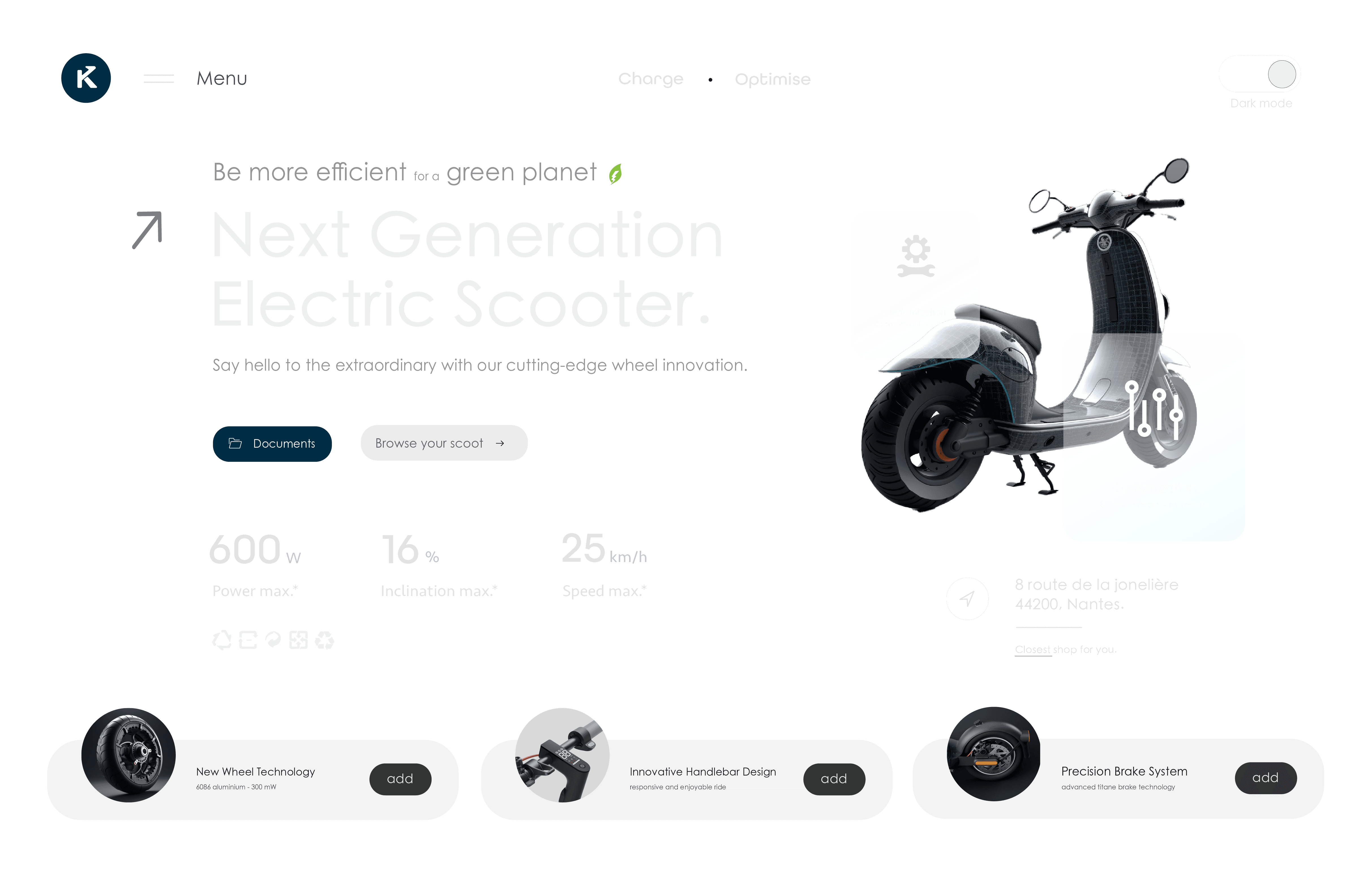
Kurb is an electric scooter brand with a unique twist — it incorporates a seat for added comfort during urban commutes. As cities continue to grow and evolve, the need for efficient, comfortable, and sustainable modes of transport becomes essential.
Kurb addresses this by offering a seated scooter designed for ease of mobility, targeting users who seek both convenience and style. The brand embodies urban agility, with a sleek, modern design and a commitment to enhancing the everyday commuting experience.
Logo Design : The curving Scooter
Logo Design : The curving Scooter
Logo creation
Sketching the design of the brand Kurb logo with Illustrator

Logo creation
Sketching the design of the brand Kurb logo with Illustrator
Logo creation
Sketching the design of the brand Kurb logo with Illustrator
Logo creation
Sketching the design of the brand Kurb logo with Illustrator
Logo first version
Creating the first logo version with black and white colors

Final version
Final version of the logo with the brand's colors

Logo creation
Sketching the design of the brand Kurb logo with Illustrator

Logo first version
Creating the first logo version with black and white colors

Final version
Final version of the logo with the brand's colors

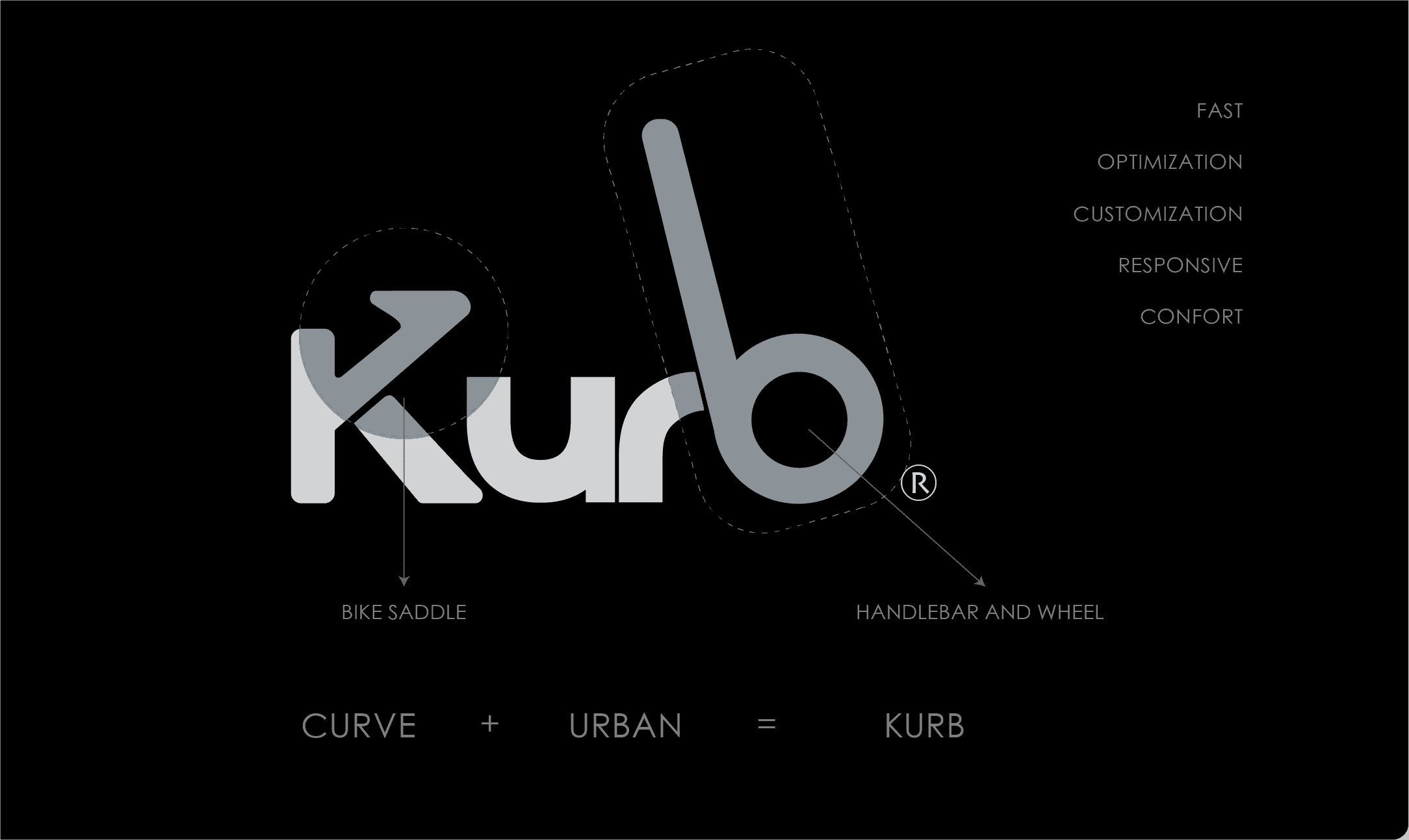
The Kurb logo was carefully crafted to visually represent the essence of the product. The key challenge was to create a logo that not only communicated the brand name but also reflected the shape and function of the scooter itself. The K forms the seat of the scooter, while the b subtly transforms into the handlebar and front wheel. This minimalist, yet highly communicative design showcases the product’s functionality at first glance, making it instantly recognizable. The sleek lines and curves of the letters reinforce the idea of movement and flexibility, key aspects of Kurb’s brand identity.
The Kurb logo was carefully crafted to visually represent the essence of the product. The key challenge was to create a logo that not only communicated the brand name but also reflected the shape and function of the scooter itself. The K forms the seat of the scooter, while the b subtly transforms into the handlebar and front wheel. This minimalist, yet highly communicative design showcases the product’s functionality at first glance, making it instantly recognizable. The sleek lines and curves of the letters reinforce the idea of movement and flexibility, key aspects of Kurb’s brand identity.
The Kurb logo was carefully crafted to visually represent the essence of the product. The key challenge was to create a logo that not only communicated the brand name but also reflected the shape and function of the scooter itself. The K forms the seat of the scooter, while the b subtly transforms into the handlebar and front wheel. This minimalist, yet highly communicative design showcases the product’s functionality at first glance, making it instantly recognizable. The sleek lines and curves of the letters reinforce the idea of movement and flexibility, key aspects of Kurb’s brand identity.
Branding and Visual Identity
Branding and Visual Identity
The overall visual identity of Kurb is driven by a modern and urban aesthetic, designed to resonate with city dwellers. The color palette draws from calming, urban tones, including Sky Blue, Prussian Blue, Cadet Grey, and Platinum Grey, with accents of Ink Black and Off White. These colors evoke a sense of innovation, reliability, and sophistication, while maintaining a connection to the urban landscape. This cohesive palette enhances the sleek and efficient vibe of the brand, both in digital and physical spaces.
The typography is clean and modern, emphasizing clarity and simplicity, ensuring easy readability across various platforms. The fonts selected convey a sense of modernity while complementing the fluid, rounded forms of the logo design.
