Babymoov is a forward-thinking company specializing in baby care products that combine innovation, functionality, and design to support parents in their daily lives. Known for its commitment to quality and ergonomic design, Babymoov aims to create solutions that not only cater to the practical needs of families but also provide comfort and style.
Babymoov is a forward-thinking company specializing in baby care products that combine innovation, functionality, and design to support parents in their daily lives. Known for its commitment to quality and ergonomic design, Babymoov aims to create solutions that not only cater to the practical needs of families but also provide comfort and style.
Babymoov is a forward-thinking company specializing in baby care products that combine innovation, functionality, and design to support parents in their daily lives. Known for its commitment to quality and ergonomic design, Babymoov aims to create solutions that not only cater to the practical needs of families but also provide comfort and style.
Project Scope and Objectives
Project Scope and Objectives
Project Scope and Objectives
Slide template
Slide
Slide calendar
1
2
3


Slide template
Slide
Slide calendar


Babymoov tasked me with developing a comprehensive Design Guidelines document to ensure a consistent visual language across all brand communications. This guide was created to serve as a unified framework for the company's internal and external designers, ensuring that Babymoov's identity remains strong and coherent across every touchpoint—from packaging to digital experiences.
The goal of the project was to define a structured, cohesive visual language that would encapsulate Babymoov's core values of trust, innovation, and care, while making it easily accessible and adaptable for all design teams involved in the brand's communication and product development.
Design Approach
Design Approach
Design Approach
The Design Guidelines were developed around Babymoov’s core brand values, focusing on key elements such as emotional resonance, distinctive forms, and brand tone. Each of these sections was crafted to reflect the brand’s commitment to quality and the well-being of both parents and children.
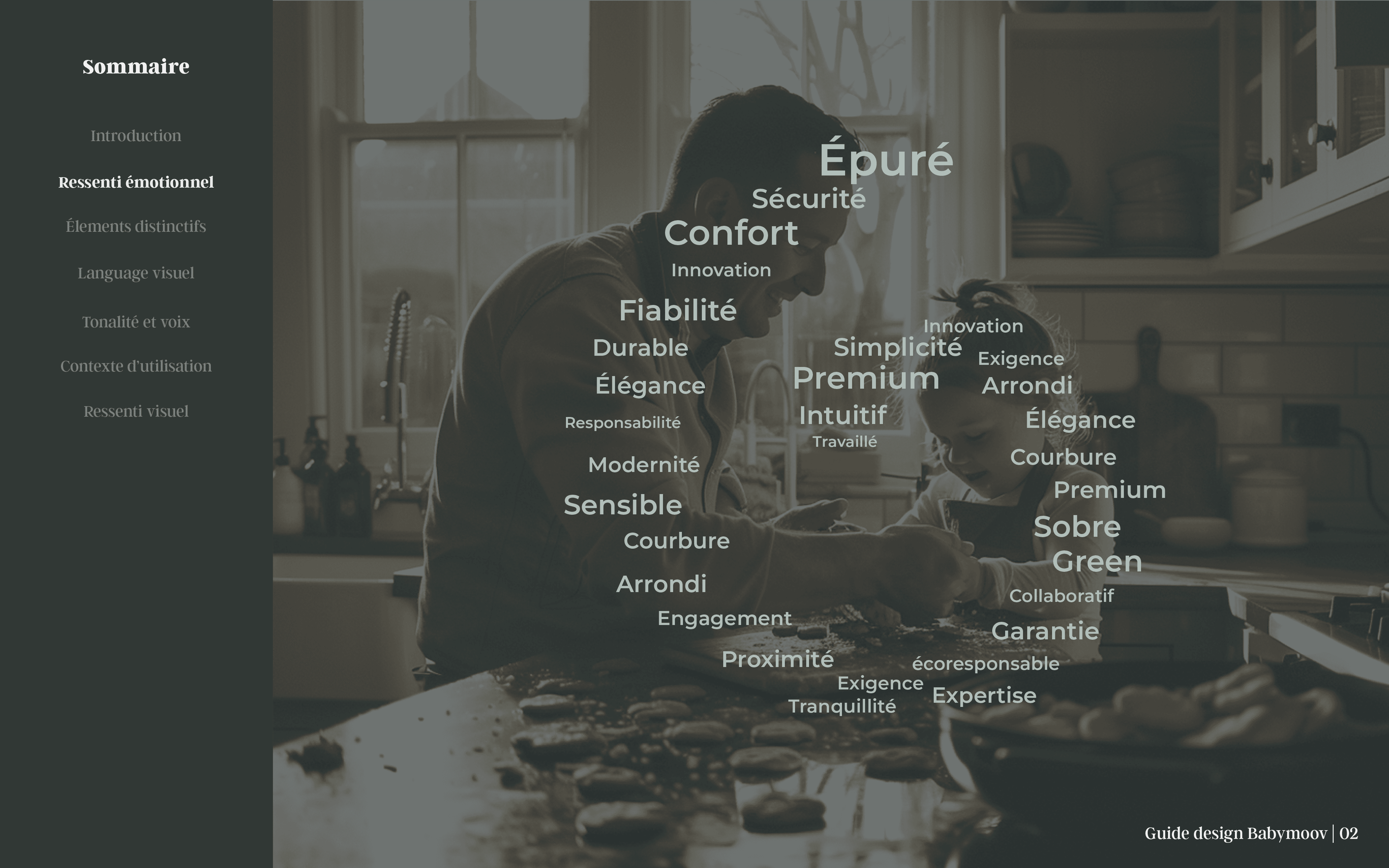
Emotional Resonance: A key aspect of the design was to reflect the warmth, security, and reliability that parents seek in Babymoov’s products. I created visual representations that align with these emotional touchpoints, using soft, welcoming imagery paired with a natural, warm color palette. The typefaces chosen are clear, modern, and friendly, enhancing the brand's approachable and trustworthy voice.
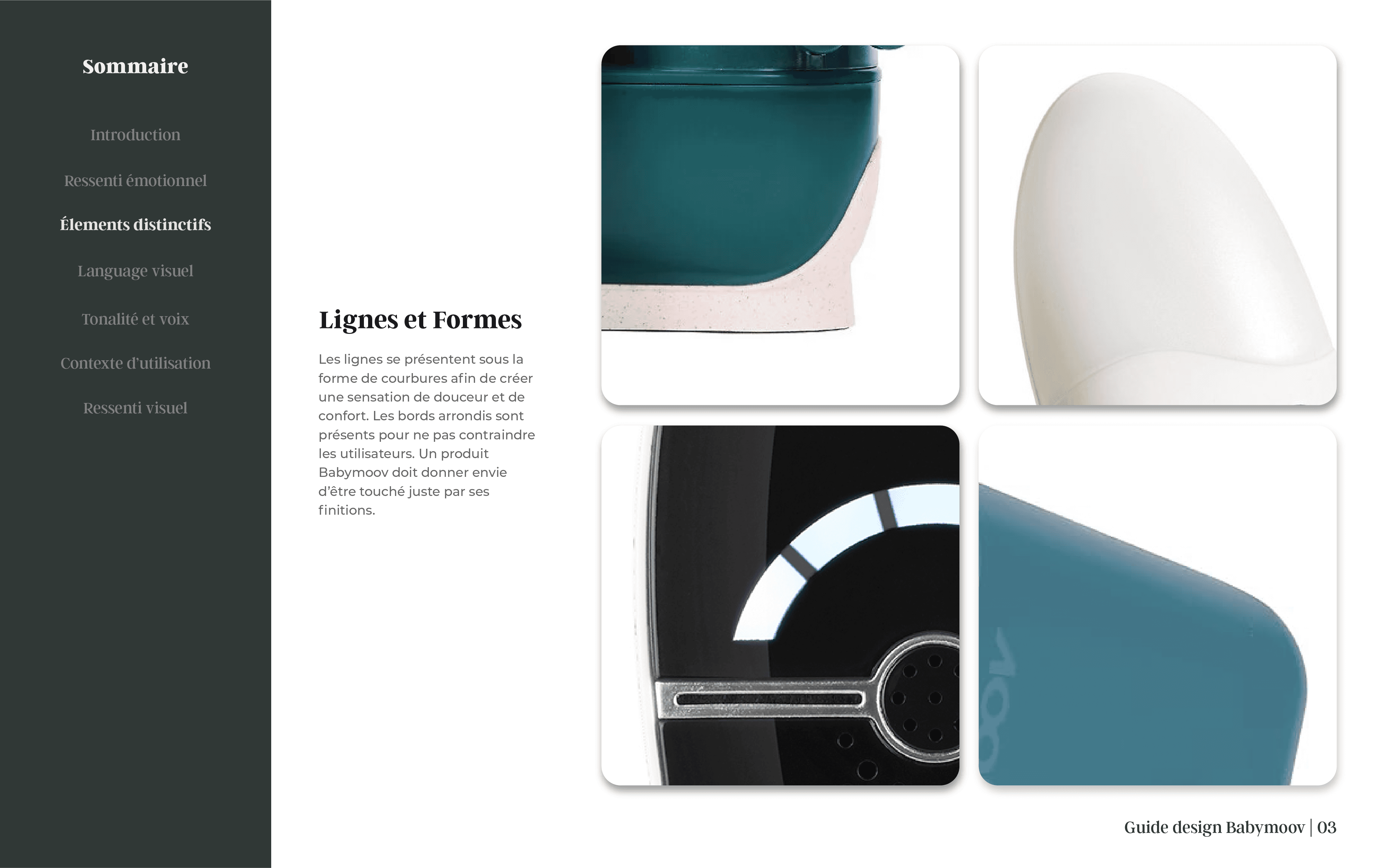
Distinctive Elements: The guidelines emphasize the importance of rounded forms and soft lines to evoke a sense of comfort and safety, key to Babymoov's product design. The brand’s visual identity extends beyond its logo, with every product detail—down to the textures and materials—being consistent with the message of comfort and innovation. I incorporated detailed guidelines on how to use curved forms and textures to ensure that the essence of the brand is reflected in all design outputs.
Color Palette and Typography: The color palette is designed to harmonize natural, earthy tones like Mustard Yellow and Deep Green, with soothing shades of grey and violet. These colors convey Babymoov's values of care, safety, and simplicity while ensuring the brand feels contemporary and relevant. The typography choices provide clarity and readability across all media, from web to print, and contribute to the brand’s nurturing and informative tone.
Brand Tone and Voice: Babymoov’s communication style is rooted in friendliness, reassurance, and expertise. I worked on defining a tone that is warm and supportive, reflecting the brand's mission to accompany parents through their journey with practical and innovative solutions. The voice guidelines are designed to keep the communication consistent across all platforms—whether it's social media, product packaging, or instructional manuals.
Babymoov tasked me with developing a comprehensive Design Guidelines document to ensure a consistent visual language across all brand communications. This guide was created to serve as a unified framework for the company's internal and external designers, ensuring that Babymoov's identity remains strong and coherent across every touchpoint—from packaging to digital experiences.
The goal of the project was to define a structured, cohesive visual language that would encapsulate Babymoov's core values of trust, innovation, and care, while making it easily accessible and adaptable for all design teams involved in the brand's communication and product development.


Do you like this project?
Let me know if you want to work with me of share a feedback.
Share feedback

Do you like this project?
Let me know if you want to work with me of share a feedback.
Share feedback
